Jonas Keller
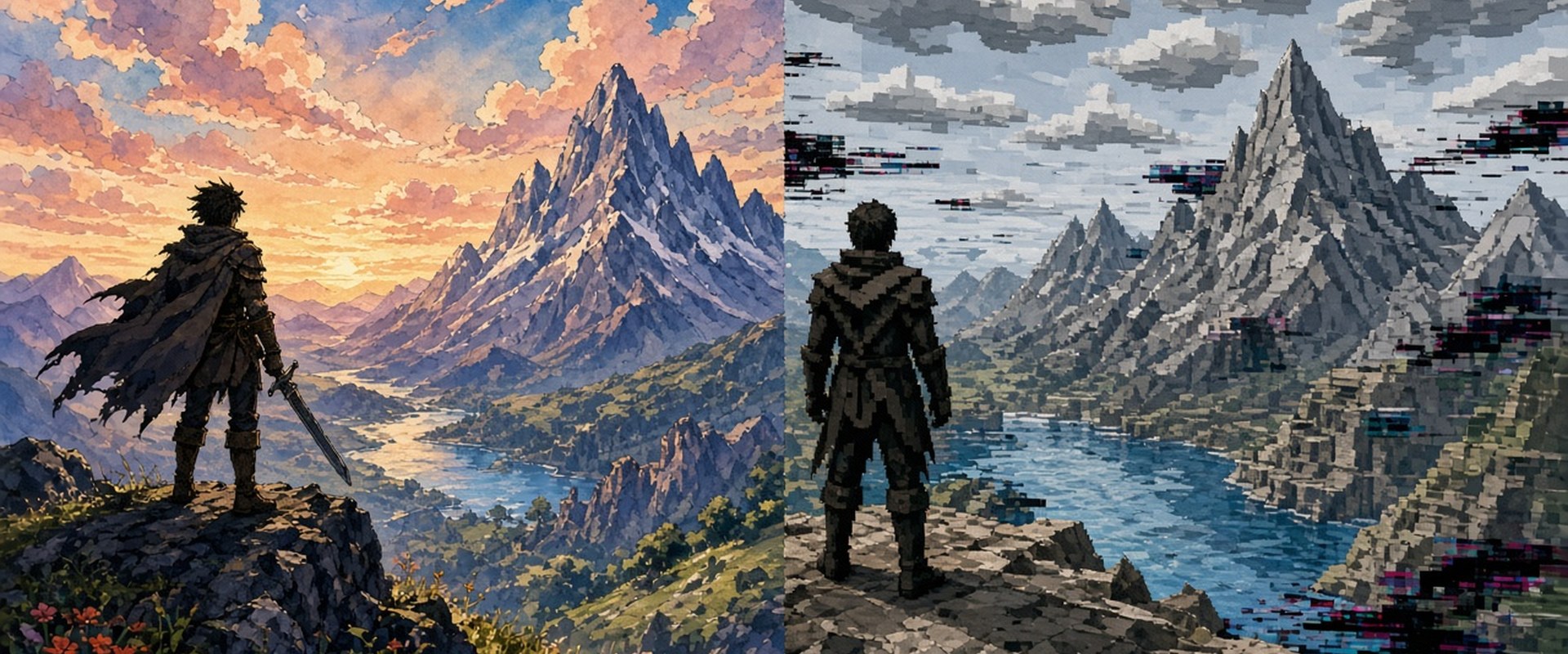
When I launch a photorealistic game from 15 years ago today, I mostly see waxy faces, muddy textures and dead eyes. When I launch Okami, I see a painting. My take: stylized graphics age better than photorealism, and studios should take that far more seriously.
At PlayInsider I mainly cover design, horror, story and art style. Few questions come up as often as this one: why do some old games still look great while others feel embarrassing after just a few years? The answer almost never lies in raw computing power. It lies in the decision whether a game wants to copy reality or invent its own visual language. Stylized graphics take the second path, and that is exactly what makes them last.
Photorealism is a race you can only lose
Photorealism measures itself against reality and against the current state of technology. Both are moving targets. What counted as "almost real" in 2010 now gets compared with every new graphics card benchmark, and it loses. Every generation brings better lighting, denser geometry and finer skin shaders. That turns every photorealistic game into a timestamp of its hardware.
Then there is the uncanny valley. Back in 1970, roboticist Masahiro Mori described how human-like figures feel more unsettling the closer they get to reality without fully reaching it (IEEE Spectrum published a translation of his essay). Many older realistic games fall right into that valley once our eyes get used to better images. A face that impressed in 2008 looks lifeless today because we suddenly see the gap to reality clearly.
Okami: Stylized graphics as a painting that does not age
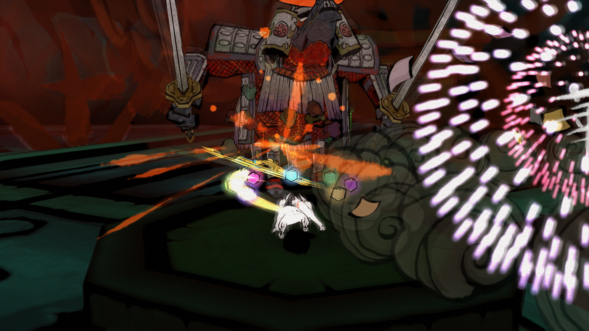
My favourite example is Okami. Capcom released it on the PlayStation 2 in 2006, hardware that was already far from cutting edge at the time. Yet in its HD version it still looks like a Japanese scroll painting in motion. The ink strokes, the paper grain, the deliberately flat colour fields: none of it tries to be realistic, so none of it can become outdated.
The numbers back this up. According to Capcom's official Platinum Titles list, Okami HD has sold around 3.1 million units since December 2017. A PS2 game that finds a million-strong audience again more than ten years after the original does not manage that on nostalgia alone. It works because the stylized art looks just as coherent on a 4K TV as it did on a CRT.
Team Fortress 2: Silhouettes instead of pores
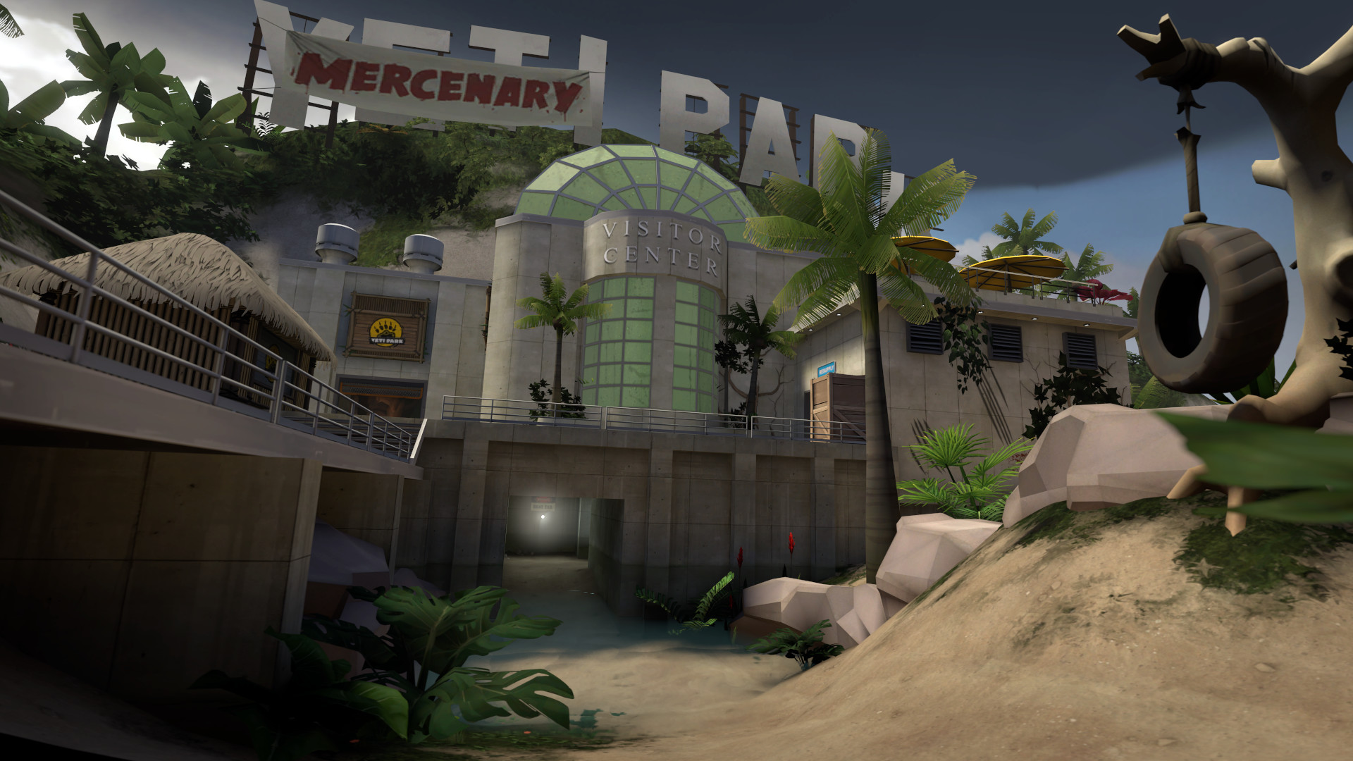
Valve was quite open about why it avoided realism in Team Fortress 2. In the 2007 paper "Illustrative Rendering in Team Fortress 2", the team describes how it took inspiration from early 20th-century commercial illustrators such as J. C. Leyendecker, Dean Cornwell and Norman Rockwell. The main goal was readability: you should recognise every class by its silhouette and every team by its colour.
Almost 20 years later, the game is still active on Steam and shows its age far less than many realistic shooters from the same era. For me, that is the key lesson: stylized graphics are not a budget solution, they are design. They decide what the player should see instead of simply showing everything. The Valve team built a visual rulebook that still holds up today.
Hades II and Silksong: Craft instead of hardware
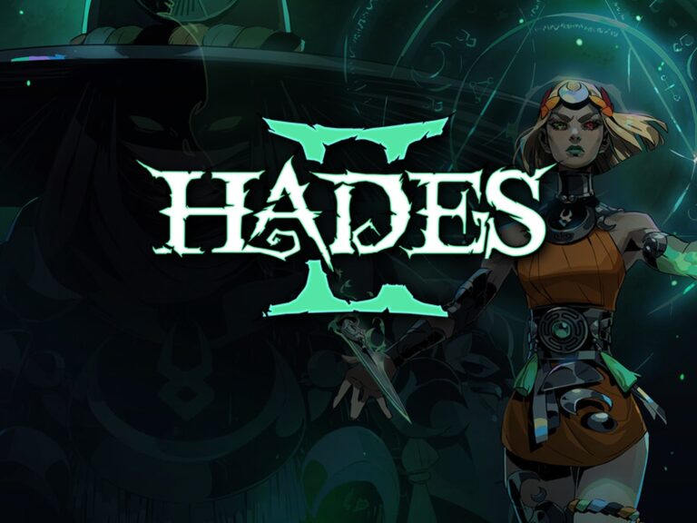
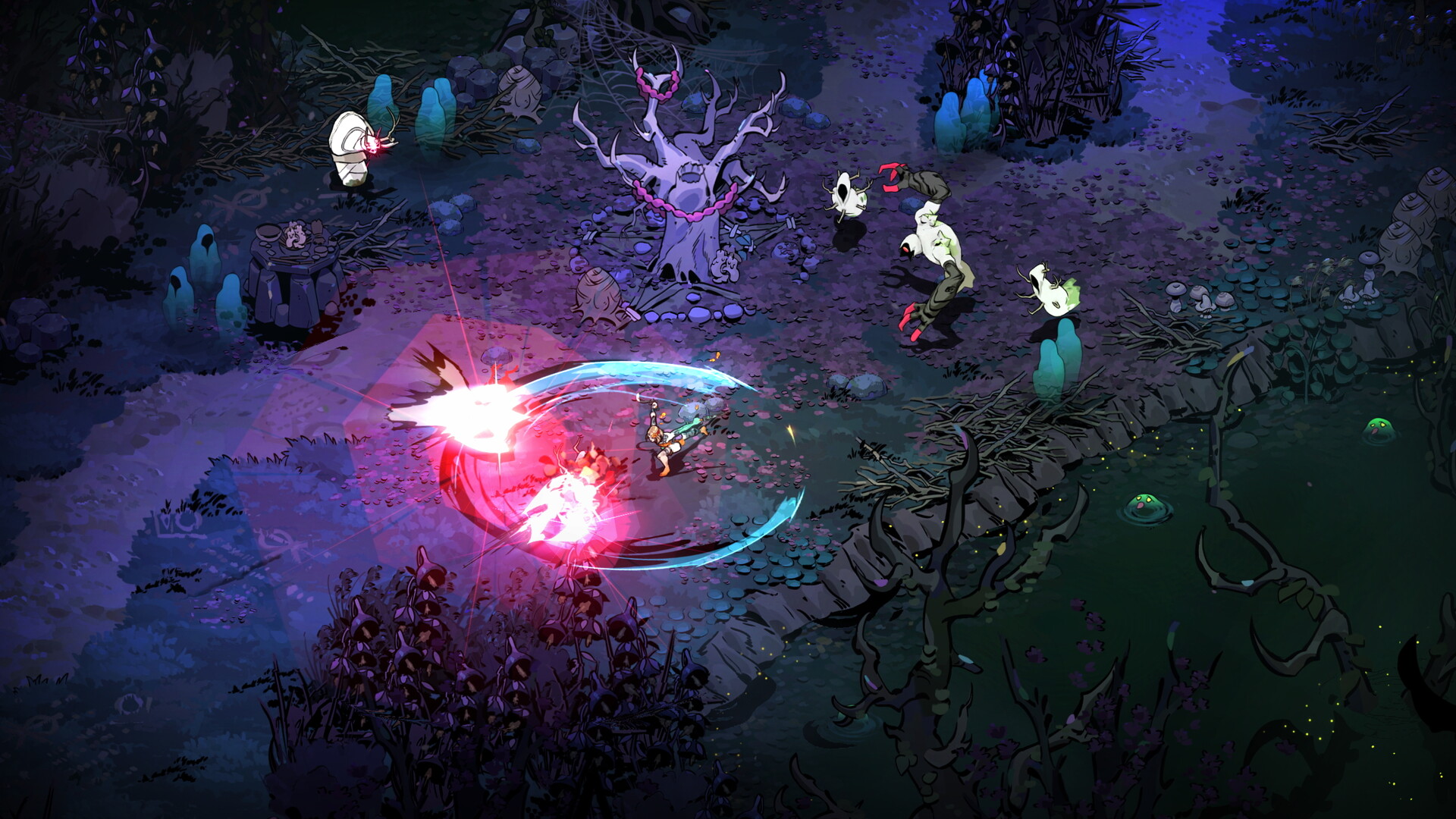
Current games show how well this works, too. Hades II by Supergiant Games thrives on the character portraits by art director Jen Zee. Strong outlines, clear colours and bold poses make every character instantly recognisable. In ten years this game will not look "old", at most like a product of its time.
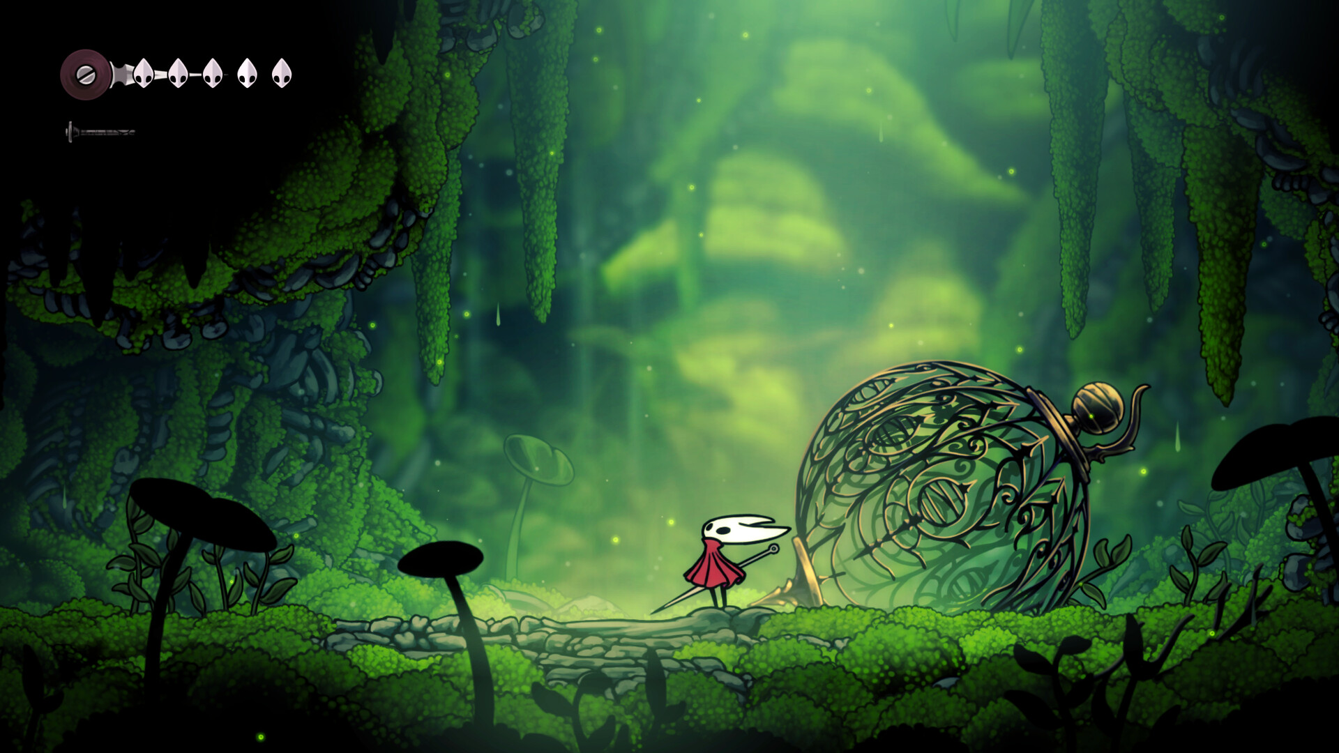
The same goes for Hollow Knight: Silksong by Team Cherry. Hand-drawn 2D art cannot be devalued by new hardware, it simply gets displayed more sharply. Its 2017 predecessor still looks as coherent today as it did at launch, and that is no coincidence.
Stylized graphics do not automatically mean a "cartoon look"
A common misunderstanding: stylization does not necessarily mean cel shading and big eyes. Clair Obscur: Expedition 33 uses highly detailed 3D models. Still, a strong artistic signature defines the game: its Belle Époque inspiration, surreal landscapes and very deliberate colour palette. That signature will remain when the technology behind it is long outdated.
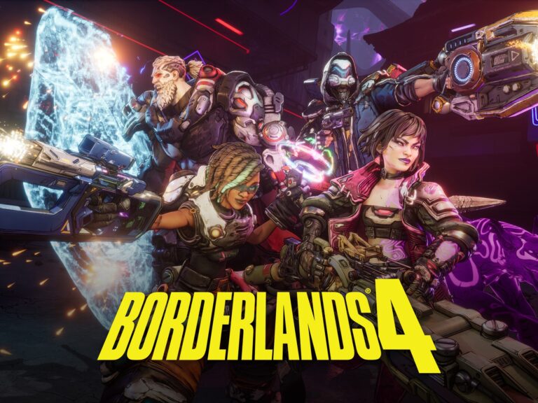
On the other hand, Borderlands 4 shows that a stylized look also needs care. The series has used its comic style with thick outlines since 2009, and that is exactly why even the first entries are still recognisably "Borderlands". A clear style becomes a brand. Photorealism, by contrast, ends up looking the same at many studios.
Where photorealism still has its place
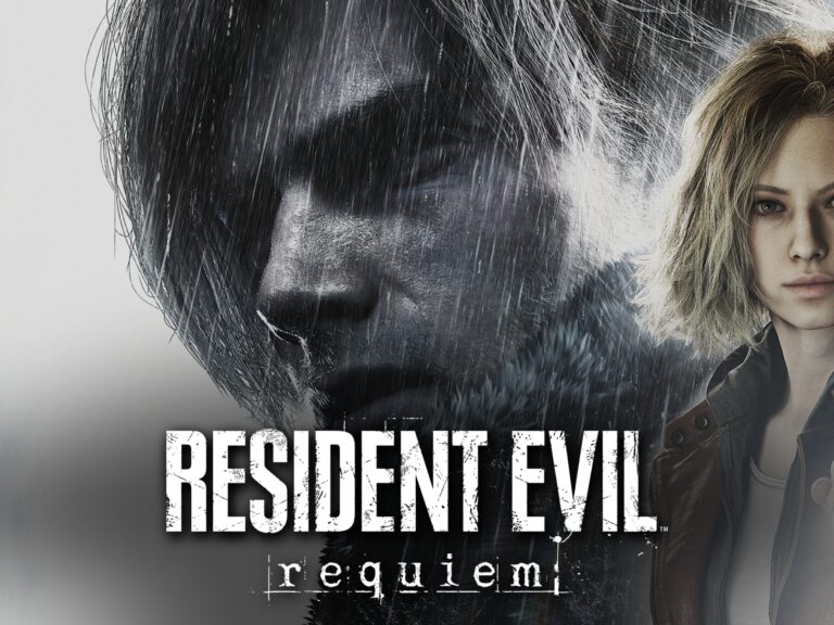
I want to stay fair, though. Some games use realism as part of their message. In horror especially, a near-real presentation can create closeness and unease, as Alan Wake 2 or the Resident Evil 4 remake show. But even there, the strongest moments usually work through light, colour and composition, in other words through artistic choices. Realistic games with a style of their own age more slowly.
The problem is not realism itself. The problem is realism as the only goal. If a game only wants to look "as real as possible", it has no foundation once the next generation arrives.
My verdict: Style beats polygons
For me the case is clear: stylized graphics are the better investment in a game's future. They do not age, they mature. Okami, Team Fortress 2, Hollow Knight and Hades have proven that for years. Photorealism is impressive in the moment, but a moment does not last forever.
I hope more big studios find the courage to pursue their own look instead of joining the race for the most realistic skin. Players do not remember polygon counts. They remember images. What do you think: which game still looks just as good to you today as it did back then?